For World Usability Day (10th November 2011) I provided 8 tips (tweets) on Information Architecture (IA) “truisms” I’d want everyone on a team to know before starting a typical website project. Twitter is a little restrictive, so I thought it would be worth fleshing them out.

Figure 1: A snippet from the @we_are_nomensa Twitter feed on World Usability Day.
1. Create the structure bottom-up, label it top-down
One of the hardest parts of a website project is to work out where everything goes. Once you’ve got a handle on what is going to be included (often via a content audit of a current site) it is best to create a structure by working with the low-level, granular content items. Even better, invite people from the website’s target audience in and get them to do it for you with card sorting. With some analysis, the structure can then be based on users’ mental model of the actual content.
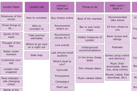
Figure 2: An example from card-sorting results that, after analysis, is combined across participants.
When it comes to labelling each area of the structure; that needs to be top-down. You can ask people in the card sorting sessions to provide names, but they are really just for ideas, it is very rare to get a coherent naming convention from a user. The aim is to have labels that have as little overlap as possible. For example, if there is a content item is about Televisions, you wouldn’t want to have ‘Electronics’ and ‘Living Room’ in the same menu. Therefore you need to come up with labels from a top-down point of view, making sure they work as part of the whole.
2. Use one categorisation scheme per menu (level)
A perfect menu would be one where any item you think of could only be under one menu option. Going back to the aim of not having overlap between options, one way of guaranteeing overlap is to have two or more ways of categorising things in a menu. For example, if you have a menu categorised by type of product (e.g. books, music, electronics) and you add “Gifts”, any item could be a gift, therefore you have a lot of overlap. Donna Spencer did an excellent article on Classification schemes (and when to use them). Another common example is adding “Publications” (a type of thing) to a topical menu. Anything that is “published” could then be in two places, the topic or publications section. It is not unusual to see a menu with three or four ways of categorising things! That isn’t to say this is some kind of golden rule that can never be broken, it is actually very difficult to be pure about it. However, if you are aware of how classification impacts overlap, you can work around it. In the example of gifts or publications, you can have those links, but keep them separate from the topical menu. Another caveat is that you can switch categorisation scheme at different levels, so long as the options presented to the user at the next level do not create overlap amongst themselves.
3. Do not structure a website by audience. Just don’t. You’ll regret it.
It is very attractive to classify content by audience, especially when you have done user-research. However, I have yet to see an example that hasn’t caused headaches. A classic example is Dell who have a top-level menu classified by audience. Where would you look for the laptop you want?
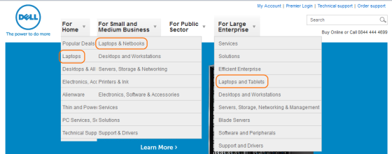
Figure 3: A screenshot from Dell’s website showing the various locations for laptops.
Would a laptop for enterprise be more powerful? Have different features? What if you are buying it for yourself whilst in the office? The point of laptops is that they could be used anywhere! Even in fairly clear situations people are often confused when trying to self-identify. Recently I was testing a site with people who have disabilities, and one lady actually started taking notes in the session, which showed it was really useful information! She was looking at guidance on increasing text-size, which is fine, except we’d recruited her as a mobility-impaired participant. What boxes are you happy to put yourself into? Another confounding situation is when you are looking for something on someone else’s behalf. There is usually a logical answer but I often see people struggle with the uncertainty of who they should be. On a practical level structuring by audience also tends to create a lot of duplicated content, as the same content is often useful to more than one audience. There is an alternative though: audience based landing pages.

Figure 4: The National Autistic Society provide three landing pages/areas that link through to main structure.
These can be really useful overview pages that link through to key content for each audience, but do not impact the overall site structure.
4. Never use a bucket as a menu item
The easiest way of creating overlap in a menu is to use a ‘bucket’ term. Prime examples are:
- Miscellaneous
- Information (or worse, “Important information”, implying the everything else is pointless!)
- Other
I call them buckets because you could chuck anything in there, which means it overlaps with everything. If you find yourself with a menu item like this, it’s time to get the sticky-notes out again.
5. Every item you add to a homepage takes attention away from every other item. (Also applies to other pages.)
A pretty logical statement, but sometimes it is a difficult one for a site-owner to deal with. Many sites have multiple audiences with multiple tasks, so the temptation is to show them all. However, without prioritisation it becomes too many things for any one person to scan through. In a worst case scenario the homepage can even become the centre of an arms-race, where various groups try and get their bit to be more and more attention-grabbing.

Figure 5: Screenshot from overclockers, loaded with attention competing elements.
You can certainly structure a page so that things are less overwhelming (e.g. grouping things in boxes), however, that only goes so far. If it is hard to get the team to agree on the prioritisation, there are some useful workshop exercises. For example, create two virtual pots of money with £10 in each. Give one pot to an internal stakeholder, and the other pot to someone representing the site users. Then each person can assign any amount of (whole) pounds to each possible homepage element. It could be £10 on one thing, or £1 on 10 things. What you should have at the end is an ordered table of elements in a combined priority order. Another aspect of clutter I try to avoid is duplicating navigation elements in close proximity. For example, if the main navigation shows the homepage and main sections, a breadcrumb trail is redundant.
6. Sometimes improving a website means people spend less time on it
This is more of a warning than a tip, but sometimes it is useful to mention to a client that some of their metrics may actually go down when the site improves! For example, an improved navigation may mean people need to go through less pages to find what they want, and spend less time scanning pages to find a link. Just make sure the success metrics actually align with business and user goals.
7. Your site-search logs can tell you what people can’t find
A common behaviour you see in usability testing is when someone loads up the first page of a site, scans the page, and decides to use the site-search. Despite an early usability-myth that users are search or browse dominant, Jared Spool showed that the design of the site has more impact on use of the search. If someone does not see their next step (get the ‘scent of information’) then they often turn to the search. Therefore what people type into the search box is often what they expected to see on the page. That is really useful information for updating the keywords on the page and in navigation.
8. FAQs can be useful when they are actually user-driven, and then used to update site content. Otherwise avoid.
Often a frequently asked questions (FAQ) section means that there is a load of content without a real home. It can also be a symptom of a poor IA because people are not seeing useful words in the menus, so an FAQ section is used to paper over the cracks. I have nothing against “frequently asked questions” so long as they are useful, which means:
- They are questions actually asked, fairly frequently, by real users.
- They are reviewed regularly and the information is used to update the IA of the site.
Any real FAQ item should have a short shelf life. The example screenshot from Canon’s Cinema EOS shows many questions that you would think are answered on the product page.

Figure 6: Canon’s “Cinema EOS” FAQ section.
Related posts
-

Blog
The importance of microcopy
Lauren Ellis, copywriter at Nomensa, outlines microcopy and explains why your business needs to start sweating the small stuff.
-
Blog
The content-first approach: How to get a competitive edge through great UX
In ‘The content-first approach: How to get a competitive edge through great UX’, Principal Content Designer Steven Shukor explored the value of good content in building trust and loyalty and driving engagement.
-

Blog
How content design makes for happy customers and search engines
Standing out from the crowd can be a struggle. Content Designer Mark Foley explains how good content design can help you do just that, while making content that is gentle on your users’ brains.
-

Blog
How to make your content migration a success
Whatever CMS you’re using or developing, content migrations are complex, lengthy and involve a lot of moving parts, challenges and dependencies. Here’s a short guide on how to successfully deliver a content migration.
We drive commercial value for our clients by creating experiences that engage and delight the people they touch.
Email us:
hello@nomensa.com
Call us:
+44 (0) 117 929 7333