Cards components continue to be heavily leaned on in website design and for good reason – they offer several key advantages:
-
- They suit mobile first, modular website layouts
-
- Generally provide large click and tap target areas for users
-
- They simplify layout decisions by offering neat horizontal and vertical stacking of content
In this post, we’re going to explore some key approaches to ensure that, as well as looking good, your cards are also accessible and offer a usable experience.
What are card components?
Cards are typically square or rectangular blocks of a user interface comprised of: a heading, a short chunk of ‘teaser’ text – summarising the content of the resulting page – and an optional image and button or ‘call-to-action’.
Common issues
There are a couple of common development approaches used in the build of cards:
- Wrapping the whole card in a link
- Making the image and the call-to-action separate links
Quite often, accessibility issues arise from how they’re built – commonly using a to wrap the whole component. This is totally understandable as an approach because it achieves the objective of making the whole thing clickable but it negatively affects the screen reader experience.
If I move to the card using my screen reader, a very long string of text content will be read out and only after this am I told the card is linked – a bit slow and maybe a bit confusing. Plus, images included in the card might not be specifically announced as ‘image’, either. Any structure is lost within the link.
Links
If the whole card is not wrapped in a link, then usually the link is provided in the form of a ‘call to action’. These provide a clear visual indicator that this thing can be clicked/tapped and they provide an extra prompt to read more. Rather than being descriptive in their own right, though, these calls to action are often vague: “Read more”, “Learn more”, “Find out more” and “Shop now”. While there might be other more descriptive link text in the card to provide clues about the link value and destination, it’s even better to avoid vague links being included at all.
Building an accessible solution
With the previous opportunities for improvement in mind, here’s an approach for a more robust, accessible card component.
Assuming a (simplified) structure of something like this HTML:
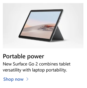
Portable power
New Surface Go 2 combines tablet versatility with laptop portability.
Shop now
Notice that the heading text is the link. Personally, I’d use the product name in the heading link, but we do have to account for the marketing aims of the page as well.
With this structure we can provide alt text which describes the image because the image is not a link as well. If the image were also a link, we’d need to describe where it is going, which makes it difficult to also provide a description of the image content.
Make the whole block clickable
We can add a simple script to the page that finds the card blocks and the link within their headings. The script applies an OnClick event to the whole block using the link target as the target of the OnClick as well. In that way the whole block is clickable, and we’re likely to have the most descriptive link text.
See the Pen Accessible cards components – block links by Joel Strohmeier (@joelstrohmeier) on CodePen.
It’s possible to use CSS absolute positioning to create a single block link which covers the card. This is a CSS-only solution which avoids JavaScript and so brings performance benefits for people running simple websites such as personal blogs. The drawback is that the block link covers the text content of the card making it harder to select. Fixing this means moving elements out from underneath the block link – essentially breaking a hole in the total clickable area. For some sites this may be a reasonable compromise. We prefer an alternative that uses a little JavaScript to provide the large click area.
Re-ordering content for improved semantics
You can achieve an image-first card appearance while retaining better underlying semantics by re-ordering content using CSS. As headings should introduce groups of content we can include one first in HTML and shuffle the visual order using CSS Flexbox layout.
See the Pen Accessible cards components – block links by Joel Strohmeier (@joelstrohmeier) on CodePen.
Visual affordance and calls-to-action
If your design doesn’t include an extra call-to-action, the steps above are already sufficient. If you need to include a call to action, you can include it as styled text, relying on the script to make it clickable. It could be inserted by the script, too, as it doesn’t make sense without that running.
See the Pen Accessible cards components – block links by Joel Strohmeier (@joelstrohmeier) on CodePen.
Bonus thoughts
From a design and maintenance perspective, here are a few other pointers:
Content design
Establishing guidelines for recommended character or word counts for the different elements within cards, such as: headings, body text and calls-to-action helps prevent awkward looking cards – cards which appear elongated by the length of text within them or otherwise contain too much information to work effectively as part of a cohesive design.
User interface
Ensure non-interactive cards are styled sufficiently different to actionable cards in order to aid user understanding
Avoid overusing cards – including too many cards in your interface designs leads to the user being presented with lots of calls-to-action with equivalent visual prominence all vying for attention which can lead to the user not interacting at all (sometimes referred to as ‘paradox of choice’)
Be careful of styling cards with strong borders, the greater the number of strong edges in a visual design, the more cluttered it can appear.
If using small categories indicators next to card headings, such as small red or yellow lozenges which read: ‘New’ or ‘Sale’, ensure the text and background colour have sufficient (4.5:1 ratio) contrast.
Performance
Unless you’re proactively taking steps to keep your web page sizes small then you’re likely creating a barrier for users because you’re requiring them to visit your site on a high-end device with a good connection speed.
Images are one of the biggest culprits for web page size so it’s important we optimise them. Tools like TinyJPG (& PNG) make this very easy. In addition to using optimisation tools to reduce file size we can also make use of the loading=”lazy” attribute. Using this means we give browsers a nudge to delay the loading of images until they’re needed. What’s great about this feature is we can use it as a ‘progressive enhancement’ – that is, browsers which understand it will go ahead and provide the speed boost for users and those which don’t will simply load images as usual.
Best of luck building beautiful, robust and accessible experiences for all your users.
Credit to Adrian Roselli and Heydon Pickering whose brilliant work has been referenced in this article.
If you’d like to talk to us about improving the accessibility of your digital product or service, drop us a line on hello@nomensa.com or call +44 (0) 117 929 7333.
Related posts
-

Blog
Accessibility in aviation
Every day, millions of people fly by airplane to destinations across the world. Each of these journeys are punctuated by a multitude of digital touch-points.…
-
")
Blog
Introduction to the European Accessibility Act (EAA)
Overview In this article, we’ll cover the basics of the European Accessibility Act (EAA) and how it might affect your business. A brief overview of…
-

Blog
What Are WAI-ARIA Document Landmark Roles?
The Accessible Rich Internet Applications (WAI-ARIA) specification defines a set of roles known as document landmarks.
-

Blog
Five assistive technologies you should be aware of
An explanation of the five assistive technologies you should be aware of. Includes mouth or head wands, speech enabled websites, screen magnifiers, voice recognition software, and the browser.
We drive commercial value for our clients by creating experiences that engage and delight the people they touch.
Email us:
hello@nomensa.com
Call us:
+44 (0) 117 929 7333