Lightbox, modal window, dialog, overlay… There are many names used to describe a component with the same (or very similar) functionality. For the purpose of this article, I will use these terms interchangeably to refer to a window which is triggered by the user, appears on top of the viewed page overlaying other content, and which must be acknowledged by the user before they can come back to the main page area. When the window is open, the rest of the page is dimmed and the user is only able to interact with that window’s content.
Overlay windows can be used to display a larger version of an image featured on the page, show additional information relevant to the main page content, or to ask the user for some input or response (for example, a login form). In terms of dialogs usability, the opinions are divided: some people say that appropriately used modal windows can enhance usability, while others highlight their deficiencies (such as the inability to bookmark content of an overlay or so called “back button confusion” causing people to try to select the browser’s “back” button to come back to the main page content). The opponents also point out that modal windows typically have many accessibility issues. Fortunately, most of these issues can be alleviated with a couple of straightforward techniques. In the first part of this article, I will discuss the most common keyboard accessibility issues present in overlay windows. In the second part I will mainly cover aspects useful for screen reader users.
Keyboard accessibility
Most of the issues found in modal windows are related to keyboard accessibility. While it’s usually possible to open a dialog using the keyboard, it’s often much more difficult to interact with its content without using a mouse. Here are the main things to remember when implementing a modal window:
Opening the dialog
The element which triggers the dialog must be keyboard accessible, i. e. keyboard users must be able to move the focus into that element and then open the dialog by pressing either the Enter or Space key. If the triggering element is implemented using appropriate HTML element which is keyboard accessible by default (e.g, ), this shouldn’t be a problem.
Moving focus into the dialog
Once the modal window is open, the keyboard focus needs to be moved to the top of that window; the next element to receive focus should be the first focusable element in the dialog. This is really important because the content of overlay windows is often placed in the code at the bottom of the page, and so it is taken out of the logical page flow.
If the focus is not correctly managed and stays on the triggering element after the dialog has been opened, keyboard users will have to tab through all other focusable elements on the page before they will be able to access the overlay window and interact with its content. Also, because the main page content is usually darkened when the dialog is open, it can be very difficult (or impossible) to see where the focus is on the page.
This can be even more confusing for screen reader users, who in this situation may struggle to find the overlay window, or even may not realise that it has appeared somewhere on the page. This problem could be avoided if the dialog content was placed in the code directly after the triggering element. In that case the overlay content would naturally follow the logical page order and its interactive elements would be by default next in the focus order. However, for consistency, it is still recommended to move the focus to the dialog.
Managing keyboard focus
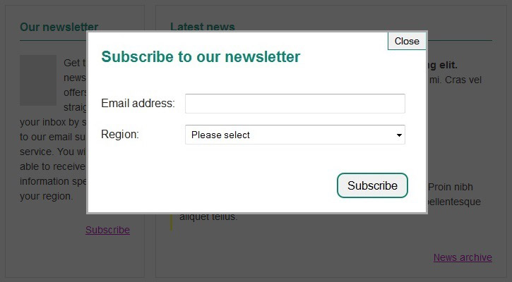
Once the focus is moved into the dialog, it should be “trapped” inside it until the dialog is closed. In other words, when the user presses the Tab key whilst the focus is still on the last focusable element within the overlay window, the focus should move back to the first one (so in our example, shown in Figure 1, it should move from the “Subscribe” button to the “Close” button. Similarly, when the user presses the Shift + Tab on the first focusable element, the focus should be moved to the dialog’s last focusable element. This is another common issue found in dialogs; it is often possible to move the focus outside the overlay window while it’s open. This can be very confusing for keyboard users, especially when the main page content is dimmed and so it’s difficult to see where the focus is on the page.
An alternative solution to keyboard focus cycling around the dialog window is to close the dialog automatically when focus is moved away from it (so in our example, when the user presses the Tab key to move the focus away from the “Subscribe” button, the overlay window should close and the focus should be moved to the next focusable element on the page, “News archive” link).
Closing the dialog
Each overlay window must have a keyboard accessible control to close that window. It’s also important to remember that this button needs to be correctly labelled – dialogs often use the “x” icon or image to indicate the ‘close’ button’s purpose without providing a text alternative for people unable to see it. If necessary, the button text could be hidden off-screen, for example using the following method:
HTML
CSS
.lightbox-close-button {
  background: url("[…]") no-repeat;
  text-indent: -999em;
  direction: ltr; }
The ‘close’ button should be highly visible and obvious, as this may help to avoid the aforementioned “back button confusion”. If the users can’t easily find the way to close the dialog, some of them are likely to use the “back” button in the browser in attempt to come back to the main page content. Making the ‘close’ button easy to see and use may help to alleviate this issue.
As well as using the “close” button, it should also be possible to close the dialog by pressing the Esc key.
Restore the focus
When the overlay is closed, the keyboard focus should be moved to the control which triggered it to open (so in our example, back to the “Subscribe” link). However, quite often when the user closes a dialog, the keyboard focus goes back to the top of the page. This means that keyboard users have to tab through the page’s content once more to go back to where they were before the overlay window opened. This can be very frustrating for keyboard users, especially if there are many focusable elements on the page.
Summary
By following these few rules it’s possible to significantly improve accessibility of overlay windows for keyboard users. In part 2 of this article, I will provide a few tips on enhancing the accessibility of dialogs for screen reader users. Start building accessibility into your projects at the beginning to save time and money, don’t just leave it hanging on the backlog letting it gather up dust. Drill it in.
Can we help?
Nomensa is an award-winning UX design agency with offices in Bristol, London and Amsterdam. If you would like us to help you with your accessibility challenges or to provide you with an accessibility evaluation of your website/mobile app, please don’t hesitate to get in touch.
You can give us a call on +44 (0) 117 929 7333 or submit our contact form. In the meantime, take a full look at the digital accessibility services that we offer.
Related posts
-

Blog
Accessibility in aviation
Every day, millions of people fly by airplane to destinations across the world. Each of these journeys are punctuated by a multitude of digital touch-points.…
-
")
Blog
Introduction to the European Accessibility Act (EAA)
Overview In this article, we’ll cover the basics of the European Accessibility Act (EAA) and how it might affect your business. A brief overview of…
-

Blog
What Are WAI-ARIA Document Landmark Roles?
The Accessible Rich Internet Applications (WAI-ARIA) specification defines a set of roles known as document landmarks.
-

Blog
Five assistive technologies you should be aware of
An explanation of the five assistive technologies you should be aware of. Includes mouth or head wands, speech enabled websites, screen magnifiers, voice recognition software, and the browser.
We drive commercial value for our clients by creating experiences that engage and delight the people they touch.
Email us:
hello@nomensa.com
Call us:
+44 (0) 117 929 7333