A lot of research goes into understanding how physical disabilities (e.g. blindness) affect users online and how support technologies can help. However, many people suffer from psychological disorders or learning difficulties which greatly affect their experiences online, and comparatively little research and development has gone into understanding and designing for these issues. One reason for this is that psychological disorders or learning difficulties are harder to define than physical disorders. Therefore they are less well understood by the public and by the UX and design industry. This article provides a brief description of the most common psychological disorders or learning difficulties and explains how they can affect a user’s experience on the web. For more details please follow the links in this article. There are five disorders and learning difficulties that I would like to introduce the reader to. There are also many others which have not been researched in relation to UX yet; I hope to motivate the reader to consider how these affect user experience. The following article provides more detail on the psychological side of inclusive design.
Dyslexia
Number of people affected: up to 10% in some form Description: Dyslexia is characterized by a difficulty in recognising characters, words and sentences due to barriers in the brain, not the eye. Certain types of characters and font are more likely to be misread than others.
UX and dyslexia
A few well known things to avoid are the use of capitals for entire words and underlining words. Yet websites commonly use both of these for attracting attention or distinguishing links from normal text. Of course, both of these can be avoided easily. It is never essential to use all CAPS, and as the image below shows, other methods of visual highlighting can be used instead of underlines.

Background colours and bolding can highlight links in place of underlining and CAPS.
Certain fonts can also give the appearance of an underline and therefore are just as difficult to read:
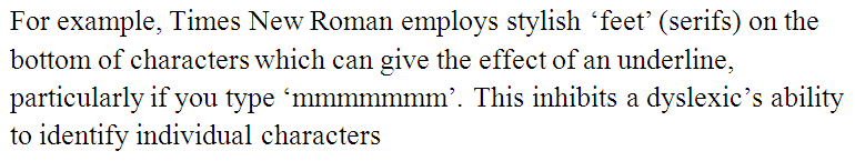
Times New Roman font can make words difficult to read
Colour contrast can also make text difficult to read for dyslexics, particularly for those with ‘Scoptic Sensitivity Syndrome’. In general, high contrast between the text and the background means that words appear to constantly move around the page. This presents a problem because high contrast is generally needed for people with visual impairments. Further Links:
Autism
Number of people affected: 0.8% in some form Description: Autism affects information processing in the brain to varying degrees, which can inhibit many processes from comprehension of all types of information to social interaction.
UX and autism
Interpreting a paragraph of text requires the brain to do a surprising amount of interpretation and processing, and for people on the autistic spectrum this becomes much harder. Common literary concepts such as sarcasm, satire, parody, allegory, metaphor and simile are not well understood. They will often take things literally. Understanding is easier when there is visible context to what you are reading. Make sure that sentences have context to them, either through what surrounds them on a page (images, buttons, and headings) or through reiteration from the previous sentence or paragraph. Typical writing on the web also includes a lot of abbreviations which can also lack context. If your site uses abbreviations the full version must be easily available in order to be accessible. Writing in a way that is highly accessible for users with autism may conflict with other user’s experience of the content. However, different versions of content could be provided in order to satisfy all users. Keywords when designing websites for autists are:
- Use efficient and concrete communication;
- Writing literal, simple and sober text;
- Offer synopses;
- Make the context visible;
- No hidden meanings.
As an example of inclusive writing for people with autism, and how different the end product might look, have a look at this Easy Read report from the Equality and Human Rights Commission (EHRC). Every new sentence is one single, separate concept, and next to each is a contextual image. The words are also all literal, i.e. there are no meanings which have to be inferred by the reader, rather than simply read from the page. Further Links: UX and Autism
Attention Deficit Hyperactivity Disorder (ADHD)
Number of people affected: 7.5% of school-aged children Description: ADHD is the co-existence of attentional problems and hyperactivity. It is normally diagnosed in children, but can affect adults as well.
UX and ADHD
Designing for ADHD requires applying usability principles to the extreme. A sufferer will typically not spend too much time on each area of a page, especially if it seems dull or there are other distractions present. The following tips are summarized from Lorna Knight’s article on Designing for ADHD.
- Provide a ‘calm’ environment, with soothing colours. No decorations or distractions (this conflicts with previous tips however);
- Distinguish important information by putting it in bold or colour. Signpost sections and group related information into panels;
- Use large print (12-14 point) and a clear sans-serif font such as Arial;
- Help pupils follow text by writing/highlighting alternate lines in different colours;
- Minimise surprises;
- Avoid having dynamic or moving images on the site.
Anxiety Disorders
Number of people affected: 13% Description: There are many anxiety disorders characterized by ‘abnormal or pathological fear or anxiety’. The most common are Generalised Anxiety disorder (GAD), Panic disorders, Phobias, Obsessive Compulsive disorder (OCD), Post-traumatic Stress disorder (PTSD) and Social Anxiety (SAD).
UX and anxiety
The Internet has arguably caused many people to develop anxiety disorders – there are many new cases of ‘Internet OCD’ where people obsessively check emails, refresh pages, or keep switching between tabs to see something that might have changed. This is presumably a similar behaviour to obsessive phone-checking, where a person feels they need to know about any change as soon as possible. There is also ‘information anxiety’; ‘stress caused by the inability to access or understand the information you need, caused by information overload, lack of clear organization to information, insufficient information, excessively difficult presentation of information, etc’ Some of us even feel the need to take a holiday to deal with what Andy Budd calls Information Anxiety Aside from the common sense rules of ordering information logically and presenting it nicely, I believe that an application can help reduce this stress further by simply informing the user how much there is before they start. Let the user know what they are in for; if your site doesn’t offer information on certain topics which the user might expect, tell the user at the earliest possible point so that they don’t go looking for it. The same goes for long application forms or surveys; it is always a good idea to tell the user how long it will take. Further Links:
Dyscalculia
Number of people affected: 3-6% Description: This is effectively the mathematical equivalent of dyslexia, where sufferers have trouble grasping mathematical concepts or interpreting symbols or equations. Like dyslexia, this is not related to IQ.
UX and dyscalculia
Mathematical concepts can creep into writing very easily, for example stating fractions or percentages, as in this article. To avoid this causing difficulty, present the meaning in a simpler form; for example ‘one out of three people’ doesn’t require any reference to a mathematical concept by the reader, but ‘33% of people’ requires you to understand that the symbol ‘%’ means ‘out of a hundred’. Most people can understand pictures more easily than numbers. Always consider the addition of a picture to help present your case. Progress bars and bar charts are perfect examples, representing percentages visually. More complex issues arise in e-commerce baskets, checkouts, and CAPTCHAs. As pointed out in the following (two-part) article, 3-6% of the population could have considerable difficulty in purchasing something from your site. Further Links:
Conclusion
There is a great deal of scope for research about how a product or user experience can be designed to accommodate psychological disorders and learning difficulties. This article introduces some easy methods for inclusive design, as well as some guidance on more difficult solutions. I hope to not only remind you of the facts, but to persuade you to consider other disorders and learning difficulties in relation to UX and come up with imaginative ways to solve the issues; I mention four more disorders or learning difficulties below (numbers affected in brackets) for which there has not been a great deal of research on, but still affect at least 1 in 100 people:
- Alzheimer’s (1% at some point in lifetime) affecting memory;
- Depression (varying statistics, up to 16% at some point in people’s lifetime and a major cause of illness in the USA) affects attention and engagement;
- Dyspraxia (5-6%) short-term memory and fine motor skills;
- Schizophrenia (1%) attention and memory.
Related posts
-

Blog
Accessibility in aviation
Every day, millions of people fly by airplane to destinations across the world. Each of these journeys are punctuated by a multitude of digital touch-points.…
-
")
Blog
Introduction to the European Accessibility Act (EAA)
Overview In this article, we’ll cover the basics of the European Accessibility Act (EAA) and how it might affect your business. A brief overview of…
-

Blog
What Are WAI-ARIA Document Landmark Roles?
The Accessible Rich Internet Applications (WAI-ARIA) specification defines a set of roles known as document landmarks.
-

Blog
Five assistive technologies you should be aware of
An explanation of the five assistive technologies you should be aware of. Includes mouth or head wands, speech enabled websites, screen magnifiers, voice recognition software, and the browser.
We drive commercial value for our clients by creating experiences that engage and delight the people they touch.
Email us:
hello@nomensa.com
Call us:
+44 (0) 117 929 7333