
It’s not often a new neo-bank takes on the competition and wins, but we’ve come to expect it from the experience we developed for the Switzerland-based neo-bank, Yuh.
In December 2022 it hit 100,000 Yuhsers(!) and has been voted by the Swiss, above huge brands such as Revolut, as the number one neo-bank that will still operate successfully in the Swiss market tomorrow (read the article!)
A testament to the competitive advantage of the collaborative strategic, UX and design skills Nomensa brought to the table:
“Yuh is colourful, relaxed, dynamic and operates close to the customer groups. In addition to concrete performance… A direct inquiry from some competitors has shown that even the competition cannot (or does not want to) escape Yuh’s charm.”
Back in November 2019, we were thrilled to be appointed as Yuh’s experience design partners.
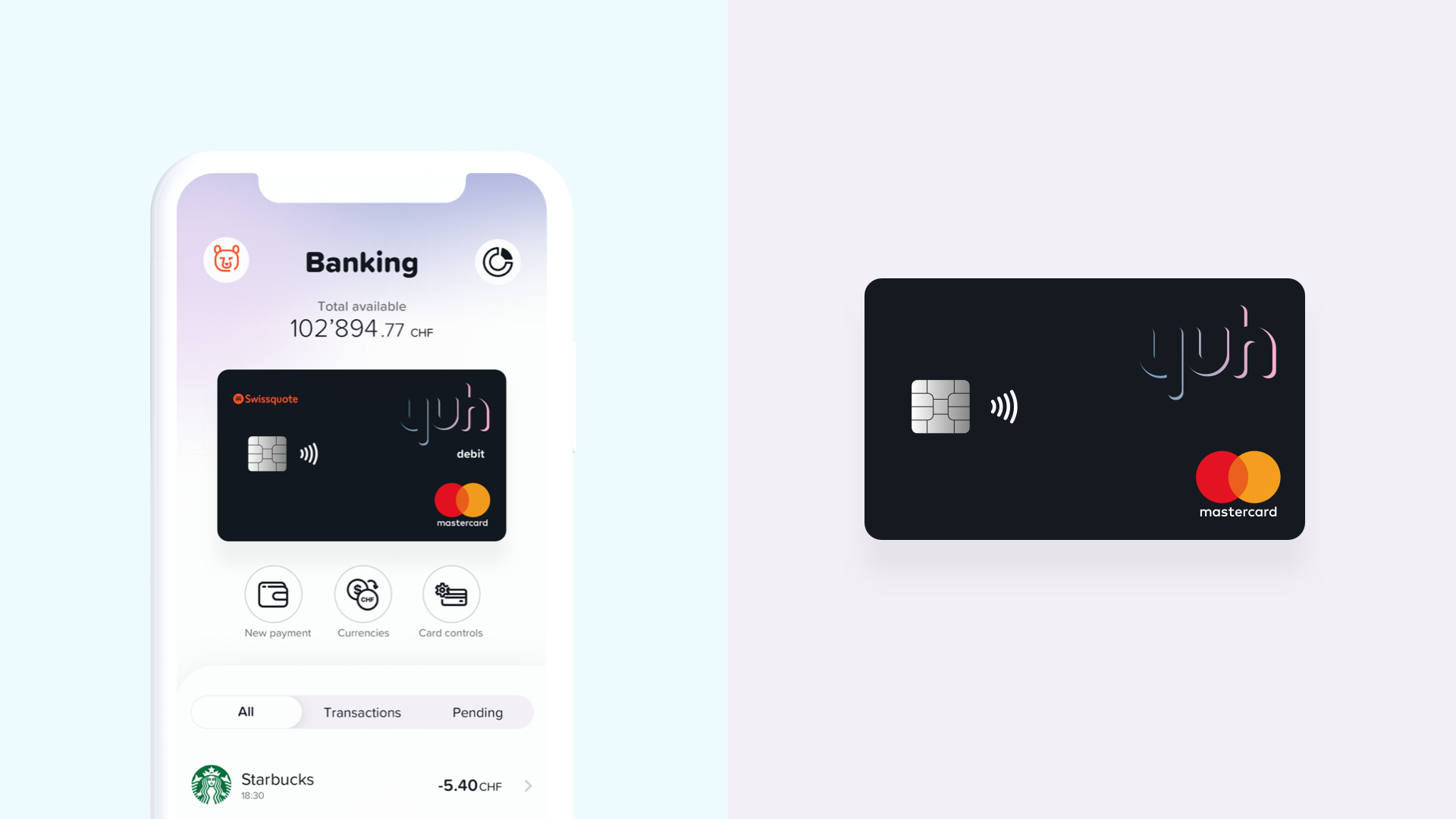
Conceived by Swissquote – a Swiss banking group specialising in the provisioning of online financial and trading services – Yuh was to be Swissquote’s disruptor in a changing banking and investment landscape.
Making investment accessible to everyone
Yuh’s core ambition was to: “become the first platform for anyone who wants to achieve financial freedom by helping clients to spend smarter and invest more.” It would weave investing, saving and banking together in a way that broke down traditional barriers.
Swissquote wanted to demystify the world of stocks, shares, crypto and day-to-day banking and prove that you didn’t have to be a financial whiz or hedge fund manager – all you needed was Yuh.
However, creating a product for previously unengaged users in an already highly competitive market wouldn’t be easy. We knew differentiation would be essential if we wanted to appeal to millennials.
Millennials, our target demographic, are known to have particularly high standards for in-app user experience. They have far less tolerance for poor customer experiences than their predecessors and put a lot of value on not only doing the right thing, but designing well and with them in mind.
Swissquote recognised that to deliver an innovative, market-changing app, they wouldn’t just have to design to a very high standard. They’d have to make excellent customer experience the very thing that set them apart from their competitors – and the driver that would keep their users coming back.
Since launch in May 2021, Yuh has steadily grown in its native Switzerland and is now available in four main languages: English, French, German and Italian. It is also delivering a sustainable new account growth rate of 1,400 new ‘Yuhsers’ per week – this is a signal of the proposition’s strong fundamentals.
It’s already clear that Yuh will shake up the investing and banking space in Europe over the next few years.
So, how did we do it?

Beginning with shared understanding
At the outset of the project, Swissquote’s Yuh team presented us with two sets of existing thinking. The first was a structured MVP composed of 27 requirements framing what the app had to do. These requirements covered core functionality as well as what we call ‘hygiene’ factors, which are features that every investing or banking app need to deliver.
Building on core functionality, we would then include other features that would create and deliver unique and tailored user experiences. These would be supplemented by a focus on a multi-currency credit card and, critically, a simplification of the investment ‘universe.’ This meant we could actively help users make better and more informed choices.
Their second set of requirements was an initial guide to the brand covering their values and the key three pillars of Yuh’s proposition: ‘Pay’, ‘Save’ and ‘Invest’. Our brief was to turn these requirements and initial thinking into a market winning app that could scale globally.
Investing in experience excellence
The Yuh team in Switzerland also showed us that behind the proposition was complex data that we had to make easy to understand, as well as delightful to engage with. This is true of our work where we can so often mistakenly think experience is all about design and style.
Really, it’s the systems we help put in place to keep the experience consistent and relevant, but also back-end systems and data the organisation requires to run the business. A great experience not only takes care of what the customer touches, but also covers the back-end systems that help measure and manage it. This is what we refer to as total experience – the business and customer together.
This perspective helped guide the creation of the Yuh brand and helped us put the customer at the heart of everything we did. Ultimately helping us to challenge the banking sector with a unique experience and tailored approach. Yuh became something fresh, bold, fun and exciting – essentially a new ‘21st century modern’.
Providing skills and leadership in integrated teams
We all know the best way to design is collaboratively. Collaborative working provides common goals and allows a shared sense of purpose to emerge – we call this a One Team approach. Nomensa complemented Swissquote by providing additional capabilities and expertise across a spectrum of skills.
Once we had established a one team approach, we then worked in design sprints to ensure we could tackle their requirements at pace, shaping the customer experience and brand within their ambitious timescales. This ensured validation through testing within each sprint too.
We also decided to form a core, dedicated team with what we called ‘orbiting skills’ to support. This included a core team of six T-shaped individuals across UX, design and project management. We also tapped into our skills pool of Motion Graphic experts, App Developers, Information Architecture (IA) leads and Content Designers.

Designing a foundation for the future
We knew from the start of the first sprint that our work on the IA would be fundamental to the app’s success. We appreciated the app would form a foundation piece within a broader omni-channel strategy, so it’s future viability had to have scalability baked-in. This also meant the IA would need to be able to cope with future demands and, of course, expanding audience types.
We understood the importance of the three pillars of Pay-Save-Invest and ensured that they would have to stand proud – a proposition that immediately resonated with the audience. This meant integrating the pillars into the design and IA. Meanwhile, clearly signposted ‘YuhLearn’ content like ‘how to’ guides and expert commentary allowing users to engage and learn at their speed in their way.
We knew that providing control was a key feature to shaping the highest quality experience, and by extension we recognised that ‘experience’ became THE feature. This meant we could then work on the style of the experience that would act as a golden thread choreographing all features, needs and expectations.
Designing a new digital proposition to make investing more accessible and fun, with experience as a differentiator, required a special kind of digital partner. We found that partner in Nomensa. They helped us realise our ambitions across all the dimensions of User Experience to shape an end result we are very proud of and expect to do very well.
Markus Schwab
CEO of Yuh
Scaling without sacrificing unique experiences
By thinking not only about today, but what tomorrow would mean for Yuh, we were able to develop a truly scalable structure that could flex and overcome future challenges and challengers. The experience strategy we crafted provided a roadmap for requirements development and integration, whilst also allowing prioritisation and validation as we moved through the tight timescales.
This can be seen in each and every detail of the app and site today. And it also meant scaling outside of digital. We even looked at how the design would be applied on physical debit cards, using metal blanks printed with sample branding to see if designs would translate well as well on and off screen.
Equally, we knew that this was not just about an app. There was potential that a web-based service would also emerge and so we knew that any IA should be developed with one eye on other platforms, too.
An atomic approach
We applied an atomic approach so Yuh could scale. This meant creating a structure that could keep feeding the expansion of the proposition and the products within it.
We also worked out that the visual design needed to mirror the IA approach, providing a structure with flexible and relevant options so that either marketers or product owners would have greater chance of responding quickly to user needs.
Our design system had to be bold, playful and, most importantly, human. Being human was vitally important as it’s one of Nomensa’s core values, too. Shared values and purpose often result in a shared focus and therefore, better outcomes. This was certainly true working with the Yuh team. It allowed us to craft a unique style of experience.
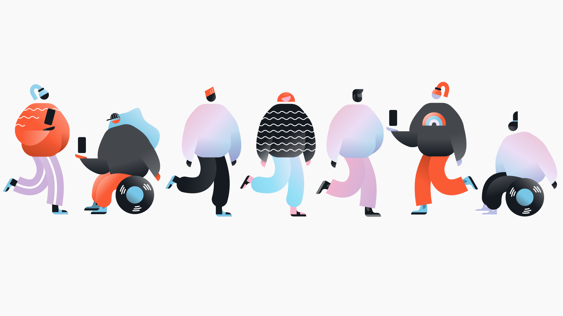
Illustrating a universe
What we needed was a unique style that would not only support and strengthen the brand but deliver a joyful feeling to every interaction with the app. And our illustration library wouldn’t just be great to look at, it represented a vital component of the overall design system that we provided.
It included both animated and static versions from the outset allowing us to build a design system strategically and intentionally with consistency, versatility and scalability at the core.
Watch our webinar ‘How to use illustration to improve UX’
Our atomic approach meant illustrations were boiled down to their most intrinsic parts (think backdrop, props and characters) and could be rebuilt by their team in a myriad of ways.
Our close collaboration with Swissquote captured their ambitions throughout the process and instilled in them confidence to continue using the design system across their estate long after launch.
Designing a global mindset
Knowing that the app rollout would eventually be global, we felt having a visual language led by a modern illustrative style would be key to clear communication and international recognition.
Initial languages were English, French, Italian and German, and we tested label lengths and text-based components to ensure consistency. This is especially important with the German language due to its famously long construction. This underlined the importance of getting the IA right from the start.
We knew that if the design supported German, without breaking the experience and style we were good to go. But we also went further to make sure that different global alphabets (Cyrillic, Far East especially) would also work in the font and designs chosen as we knew this would minimise future work when adapting the interfaces for specific markets.
Launch and legacy
By supporting the Yuh development team right up to launch, they were able to apply the design framework exactly as conceived and tested. Like all our strategic design work, this was about the potential outcome and not the outputs.
A significant aspect of our legacy has been the the partnership we formed with Swissquote and the Yuh project team – a testimony to the way we worked. Blending Swissquote’s sector knowledge and their passion for the Yuh brand with Nomensa’s experience design skills has set Yuh up for maximum advantage.
Let’s work together
We believe that creating groundbreaking experiences that make measurable differences in the way people live takes a special type of collaboration. Our team designs impactful experiences by leaning on the variety of capabilities and expertise within Nomensa to ensure our solution is bespoke to your needs. We believe collaboration is key, let’s work together.

Yuh is leading FinTech’s charge in Europe to transform traditional banking and all our team here at Nomensa are really excited to see what comes next. If you’ve got your own disruptive digital design in mind, we’ve got the team to help you bring it to life. Get in touch with our experts today to get started.