A typical interaction with websites involves filling in forms. When shopping online, for example, you must enter card details, delivery address and other personal information which generate error messages. In this article, we look at how to provide user-friendly error messages.
Outline
In order to display error messages on forms, you need to consider the following four basic rules:
- The error message needs to be short and meaningful
- The placement of the message needs to be associated with the field
- The message style needs to be separated from the style of the field labels and instructions
- The style of the error field needs to be different than the normal field
By combining these four rules, it is possible to provide the necessary information to users where they have made mistakes on filling in forms and how to rectify them quickly and easily. This will encourage and help users to continue with their journey on the site; reduce basket abandonment; increase site registrations; increase enquiries about an application form and so forth.
Through clever placement of labels, instructions to fill in a field and additional design elements can make a form less daunting and may result in fewer mistakes made (Jarrett, C. and Gaffney, G., 2008). However, I have seen that users make the same mistakes on forms again and again as these websites show error messages which are either not very clear to the user or, because of their placement, users are unclear what messages relate to. This article focuses on how to provide error messages on forms from a user experience perspective.
The message
The error message needs to be clear, precise, short and punchy. Users should be able to immediately understand what ‘mistakes they have made’ and how to recover the error. This is fundamental and will have a huge impact if users can’t immediately understand what mistake they have made. One example of an unclear error message is on the Hotmail registration page where it asks for user’s ‘Birth year’. Before the year 2000, it was common to use only two digits to represent a year. In this instance, the form does not give any instruction on that; even the error message does not give a clear idea of what was wrong with entering two digits for a birth year.

Figure 1: Hotmail registration page- error message not providing how to put the birth year (e.g. ‘yyyy’)
The error message should mention the format of the birth year that the user needs to follow, for example “Please enter birth year in 4 digits (e.g. 1973)” as shown in the following figure.

Figure 2: Improved error message to make it clear to people what mistake they have made
The placement
Not only does the message need to be short and concise, but it also needs to be well placed to associate it with the field. This poses the question of where is it best to place an error message- above, after, left or right of the field? This depends on the type of the error message. If it is a ‘missing required field’ error, it can be placed on top, to the right or to the bottom of the field.

Figure 3: Showing example of ‘missing required field’ error messages at the bottom of the associated fields (from eBay)

Figure 4: Showing example of ‘missing required field’ error messages above the labels
The association between the field and the error message needs to be visually clear. Although this might not be a large usability issue for smaller forms like Figure 5 (Google login form), for a long form, this might significantly confuse and lead to repeated mistakes (as shown in Figure 6).

Figure 5 : Google login error message

Figure 6 : Error messages displayed the same way as Google login for a long form which might confuse users
For an ‘instructional’ error message, it is particularly important to consider careful placement as we need users to read the instruction and follow it to fill in the field. Previous research on label placement by Matteo Penzo and further investigation by Caroline Jarrett revealed that instructions for filling in forms work best when placed above the field. Therefore, if it is necessary for the user to read an instruction to fill in the field, it is best to also provide the error message at the top of the field.
For example, the LinkedIn registration form provides both types of error message (‘missing required field’ and ‘instructional’ error messages) at the top of the field and just beside the labels. By doing this, when a user is completing the form, they would read the label, then look at the error they have made (and how to rectify it) and then re-enter their answer in the field after the error message.

Figure 7: Error messages displayed matching user reading pattern
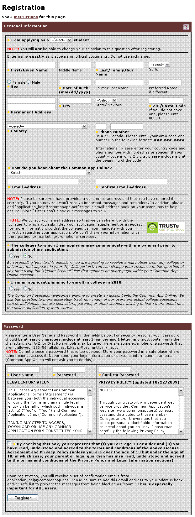
So, what about long forms? We have seen from our previous experience that if a user makes a mistake filling out a long form, and the field in error is below the fold, they get confused trying to understand what happened.

Figure 8: Example of a long form (from The Common Application)
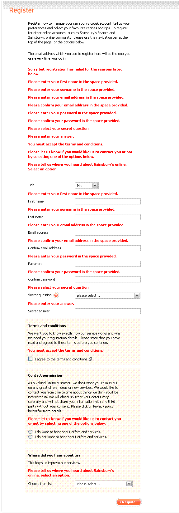
To prevent this, it is necessary to list the errors at the top of the page as well as showing the error messages associated with the fields. This will give a clear indication to users about where they have made mistakes. However, it is necessary to make sure that these error messages don’t overwhelm the users as in the example shown in Figure 9.

Figure 9 : Error messages shown at the top and with the associated fields (Sainsbury’s register page)
The message style
Users must be able to distinguish between form labels, instructions and error messages. Using different font size and colour will provide visual cues to users about why the form could not be submitted and what mistakes they made.
The field style
In addition to the message style, the style of the error fields needs to be distinguishable from the normal input field. This usually helps in a long form where the user made only one or two mistakes. They can then easily spot where they have made mistakes and rectify them.

Figure 10: WordPress registration form giving a different border style on the error field
Example of using the four point rules for displaying error messages
In a usability testing session of an e-commerce website, one tester was trying to purchase a product. This particular website requires all users to be registered before the purchase process begins. During the registration process, the user filled out the form with her name, a username and a password and submitted it. The same form was then displayed with an error message: “Please type a new user name with a mixture of alphanumeric characters ranging from 6-14 characters. This has to be unique for all of our customers.” Additionally, the password field where she had entered her desired password became empty.
The tester thought that she had made a mistake with the password. So she entered a new password with numbers, characters and capital letters, re-entered it, and submitted the form. The same thing came up again. She was certain that the password she had given had a mixture of characters and numbers with capital letters, so why wasn’t it working? Frustrated with the system, she re-read the message slowly and finally understood where she was making the mistake; it was the ‘username’ she needed to worry about and not the password.
So she entered a different user name with all the necessary characters and submitted the form. This time the form said that the password field was empty… Although this happened in lab conditions, I am not sure how desirable the product has to be to persevere with this registration process to buy it. Her response was to gve up and try to find the same product on another website.
Now, what went wrong?
First of all, the form was poorly designed without any instructions up-front about the user name. But that’s a whole other topic of designing effective forms and where to put instructions (about which Caroline Jarrett and Luke Wroblewski have written some great articles and books). Secondly, the way of describing the error was poor. Let’s put it into perspective- someone is trying to buy something from you, they don’t have the whole day to read a big explanation of “Why they are wrong!” Thirdly, the position of the error message made it unclear to the user which field it was related to. And finally, there was no visual cue for which field the user had to modify to rectify ‘their’ error. This made the user change her password rather than changing the username resulting in the same error message coming up repeatedly on the form.
Using the basic four point rules of displaying error messages
If we adopt these rules for the example shown above, we can come up with multiple solutions.
Displaying error messages on the forms with labels placed on the left:
For example, if we want to fix the error message which said “Please type a new username with a mixture of alphanumeric characters ranging from 6-14 characters. This has to be unique for all of our customers.”, it might become something like “Username must be 6-14 characters long and must contain at least 1 number and 1 character.”. Using placement and styling rules, we can provide the following example:

Figure 11: Example of using the 4 point rules of displaying error message
Displaying error messages following a user’s reading pattern:
If the labels are provided above the fields, following example shows how you can provide the error messages and match a user’s reading pattern:

Figure 12: Example of using the 4 point rules of displaying error messages on a form
Conclusion
Ever changing web technologies and evolving user behaviour towards the web makes it difficult to standardise web experience. However, we can attempt to make things better by providing a good user experience from what we have learnt. At Nomensa, we conduct experiments to identify best practice and solutions. We witness people struggling to fill out different types of forms on a daily basis. By using the combination of the four rules to display error messages and our own methods of multi-variant testing to display error messages, we can help people achieve their goals as smoothly and as quickly as possible.
Displaying form error messages might be a small part of a large website, but it can have a significant impact on people, especially if they cannot understand the mistakes they have made. This would ultimately cause them to leave the site. By combining these four rules to display error messages, you can tell people very politely what mistakes they have made and help them to easily recover and complete their journey.
UX Design can be a real differentiator for your products and services and getting it right can set you apart from your competition, which is something we explore in depth in this article ‘The value of strategic UX’.
Nomensa is an award-winning UX design agency with offices in Bristol, London and Amsterdam.
If you would like us to help you with your user experience challenges or to provide you with a UX evaluation of your website/mobile app, please don’t hesitate to get in touch. Take a full look at the UX Design services that we offer.
References
- Jarrett, C. and Gaffney, G., Forms that work, Designing web forms for Usability, 2008.
- Penzo, M., Label Placement in Forms, Published in UX Matters, July 2006.
- Wroblewski, L., Web Application Form Design, January 2005.
We drive commercial value for our clients by creating experiences that engage and delight the people they touch.
Email us:
hello@nomensa.com
Call us:
+44 (0) 117 929 7333

