It’s an exciting time to be an illustrator in the user experience design world. Big names like Slack, Airbnb, Dropbox, Uber, Google and Facebook are doing it, and I’m hearing more and more mention of illustration within the design community.
When you come across a well designed and executed illustration within a digital experience it’s easy to see, and enjoy the benefits. But how did it get there? There can be an air of mystery around the practice of illustration. Sounds romantic but where there’s mystery, there’s uncertainty, and uncertainty creates barriers.
Illustration is a noticeable latecomer to the UX designers toolbox. Designers with no background in illustration might be hesitant to suggest using it, and product owners or marketing/content leads who haven’t experienced the process of creating illustrations might, understandably feel cautious, and see it as a risk, an unknown.
I’ve been practicing illustration offline and online throughout my professional life, and it still felt like “breaking new ground” to create illustrations for digital experiences.
Now, I automatically consider UX illustration as an option because I have knowledge and confidence in it. This article is a reflection on a few things I’ve learnt, to help demystify the practice of UX illustration within digital experience design, and enable product owners, marketing/content leads and designers to start considering UX illustration within their projects.
Firstly, what is an illustration?
Context is everything. We’ve all been that person in a meeting who is hesitant to ask the dumb question for fear of looking stupid. Always ask the dumb question. It’s likely you’re not the only one thinking it, and even those who think they know will benefit from hearing the answer because it aligns the room and removes assumptions. So, here are two ways to define UX illustration.
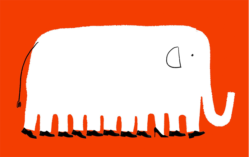
1. UX illustration defined as a type of content
![]()
• Copywriting is usually the base method of content communication. It’s specific to a language and non visual.
• An icon represents a single meaning or direction. Icons must be instantly clear, with the ability to span multiple languages. Generally everyone knows the meanings of common icons, or learns them in the end. Settings cogs, save icons, home icons, are just some examples.
• A photo is an exact representation of a subject matter. In some scenarios this is crucial, for example selling physical products, or advertising a type of accommodation or a travel destination. Or if you need to reference a person who exists in real life.
• Illustrations communicate an idea, or a series of ideas. They fill the niche when using a photo might be misleading, or distracting, because of the unnecessary ‘exact-ness’ of detail. And using an icon might not offer the amount of visual complexity required to communicate the message.
• Diagrams are used for plotting exact data in a visual way. Like photos they’re serving up an exact representation of their subject matter.
Of course content may sometimes float between multiple definitions, or combine elements of more than one definition, but putting this structure of definition in place felt helpful, and can be used as a rationale when making design decisions.
2. UX illustration defined as a type of illustration
As part of our webinar “How to use illustration to improve UX” Kate and I compared UX illustration to other kinds of illustration, in order to create this definition:
UX illustration is used to shape digital experiences and is validated by usability testing.
Learn more about our thinking behind this definition, and how illustration can support UX in Kate’s blog: UX design and the case for illustration.
Talking about digital illustration, the use case that people commonly identify is illustration accompanying articles online. For example this illustration by Andrea D’Aquino for The New York Times article The G.O.P. Is a Boys’ Club. This Woman Is Trying to Change That.
This is called editorial. UX illustration is different, and here are some comparisons to explain why:
UX illustrations are designed into a wider experience. Typically an editorial illustration will be commissioned and produced in reaction to a piece of written content. A UX illustration will be commissioned and produced much earlier in the process and therefore designed into an experience.
UX illustrations are tested with users. An editorial illustration is not normally tested with users, because if the illustration is not to your personal taste it shouldn’t create a barrier between them and the written content. A UX illustration has a job to do, so usability testing is carried out to make sure the job is being done, and ideally being done well. We talk through a few illustration usability testing examples in our webinar “How to use illustration to improve UX”.
UX illustrations are designed for long term use. Because an editorial illustration is usually produced in reaction to a specific piece of content, it usually means the shelf life is limited. A well designed UX illustration should stick around and perform its job for longer term.
UX illustrations are reusable. Usually an editorial illustration will have a single use case. It would be unusual to use an editorial illustration again for a different piece of content. In contrast to this, UX illustrations can be created as a library of reusable assets – surfaced in more than one place where relevant within a digital experience. Slack are an excellent example of a brand using a library of illustration, find out more about how they created their library, and how they use it in Alice Lee’s article Character, process, & heart: Creating Slack’s illustration voice.
UX illustrations can be interactive. An editorial illustration is not usually something you interact with, whereas UX illustration can be interactive. It might animate on interaction, or display in reaction to something else the user is doing on the site, for example completing a form successfully, or unsuccessfully. Here’s an example of an illustration that reacts to your mouse cursor as you decide whether to unsubscribe from a weekly newsletter: Animated Unsubscribe Modal by Agathe.
Be open to UX illustration as an option
Typically a design process begins with various forms of user research which then help to define the user journeys. UX consultants, designers and ideally* copywriters are working together to design the experience with the user at the forefront of their minds. This stage is exciting, and emotive. The possibilities of the ‘yet to be designed’ experience feel just beyond the horizon, ready to be discovered and claimed, and the research stage, still fresh in the mind, contributes to each decision being made: this is the perfect time to consider illustration.
* Take a read of ‘The Power of Three’ to find out more about multidisciplinary team collaboration.

UX Illustration can be a good solution to a design problem. It’s not always the right answer, but in order to be considered it needs to be represented in the initial lineup of options. This way, the need can be identified early, allowing the team to consider how the rest of the design can flex in response.
When we start looking for solutions it seems second nature to mentally scan through our familiar methods of communication and consider copywriting, buttons, photos, icons, videos. This is where we can add illustration to the drop list of options within the toolbox of our imagination.

Try it with your project team: download my short eBook ‘When to illustrate – A guide for teams’ to use our ‘starter for ten’ decision tree and start surfacing opportunities for illustration. Answer the questions at the point in your project where your user journeys have been defined to see if you should consider illustration as a solution to a problem.
It’s an exciting time for UX illustration
Finding ways to emotionally connect with users is always exciting. It’s how we build relationships in real life, and digitally. Allowing a user to feel considered has many positive benefits, and makes for a smoother experience. UX illustration is one of many ways to forge connections and I get a little jolt of excitement every time I see a good, well considered illustrative approach.
This reflection has hopefully provided a bit of insight into when and how to start considering UX illustration and spot those opportunities. In a future post we’ll explore what to do next; how to determine the right style and content for UX illustrations.
Kate and I have been busy advocating the use of UX illustration, and celebrating the many positive effects illustration can bring to an experience. If you’d like to catch up, here are our articles: Let’s talk about illustration and UX design and the case for illustration and watch our webinar: How to use illustration to improve UX.
Related posts
-

Blog
What’s the value of prototyping in UX design?
Oliver Rouse, UX Consultant, explores the value of prototypes in UX design, sharing examples of different formats and how these can work for you.
-
Blog
Why are personas so important in UX design?
Lauren Ellis, copywriter, explores how personas are used in UX design as archetypal characters who represent the needs, ambitions, goals and behaviours of a particular user segment.
-
Blog
Four reasons to invest in UX design
Megan Ellis – UX Consultant here at Nomensa – shares her four top reasons why investing in UX design can drive real commercial value.
-
Blog
How does Service Design differ between the private and public sector?
Zoe Bierman – Principal UX Consultant – explores some universal Service Design truths she’s identified that transcend public and private sector.
We drive commercial value for our clients by creating experiences that engage and delight the people they touch.
Email us:
hello@nomensa.com
Call us:
+44 (0) 117 929 7333