
Discover the latest advancements in web accessibility with WCAG 2.2.
From new success criteria focusing on mobile interaction to cognitive disability support, learn how these guidelines pave the way for a more inclusive digital experience.
On the 5th of October 2023 the W3C released the updated Web Contact Accessibility Guidelines (WCAG), bumping it up to version 2.2. Nomensa, by the great effort of our co-founder Alastair Campbell as co-chair of the working group, are very proud of the contributions we’ve been able to make in getting this next step in web accessibility realised.
What is the WCAG?
The WCAG was first created in 1999 to provide a baseline set of guidelines for accessibility support on the web. These guidelines help ensure that everyone, including people with disabilities, can participate online by allowing them to navigate, perceive and understand online content.
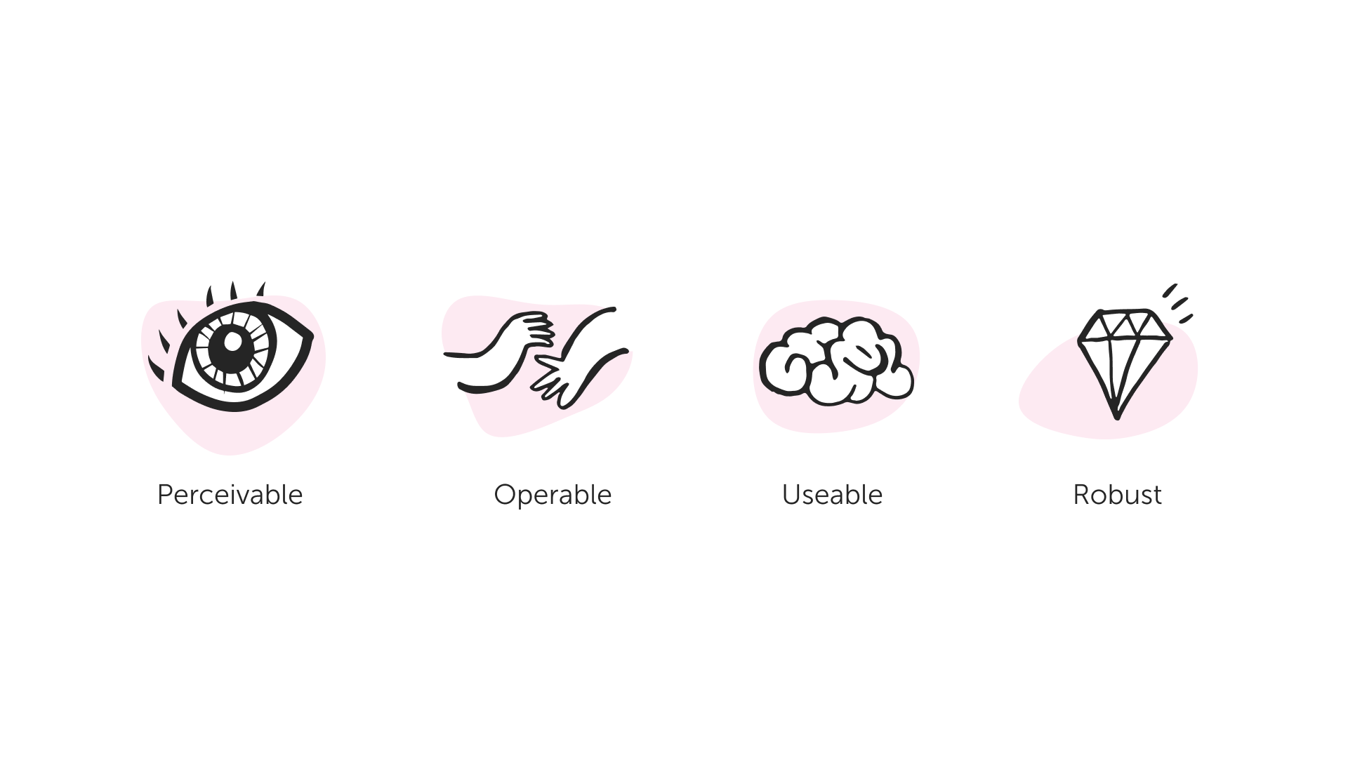
From version 2.0 (2008) onwards, the four core principles were introduced, abbreviated as the POUR principles. These four principles are Perceivable, Operable, Usable, and Robust, with each principle having a set of guidelines containing success criteria to increase web accessibility.
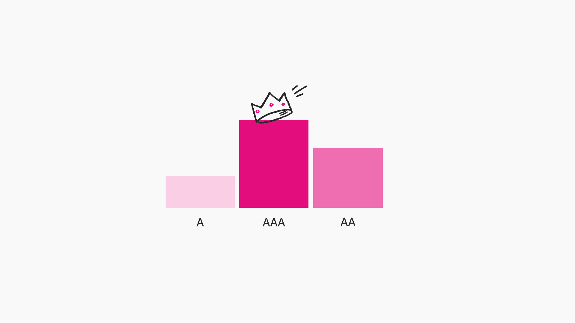
All success criteria (SC) within WCAG are designated across three different levels, level A, AA and AAA. The level A and AA SC are considered the baseline minimum to meet in accessibility legislation worldwide. The level AAA SC are still highly recommended, but generally harder to implement. Meeting even level AAA will also not directly mean that a website is fully accessible for every individual.
WCAG 2.2 in UK legislation
Under the current Public Sector (Websites and Mobile Apps) Accessibility Regulations (PSAR), which came into effect in 2018, the WCAG is the standard to meet. Its 2022 amendment changed the reference to any version of WCAG (version 2.1 at the time) and replaced it with “the recommended version” by the World Wide Web Consortium (W3C).
This means that, with WCAG 2.2 being the new recommended version, this now applies to the PSAR, with a 1-year grace period. Monitoring for WCAG 2.2 conformance will therefore start from October 2024.
What’s updated with version 2.2?
With the recent release of version 2.2 of the WCAG, further steps have been made to increase coverage for newly emerging situations previously not covered. The focus areas for the X new success criteria are mobile device interaction and supporting people with cognitive disabilities.
Success criterion ‘4.1.1 Parsing’ removed.
For the first time, one SC gets removed from the guidelines. SC 4.1.1 Parsing is deemed no longer needed because assistive technologies (AT) no longer need to parse the HTML from a page to function. These days, the browser does this work and feeds the information to the browser’s Accessibility Tree, which AT can read through the operating system’s Accessibility API.
The success criterion is still mentioned in WCAG 2.2 to maintain correct numbering, but a warning was added, mentioning it’s made obsolete, and its level was removed.
New success criteria added.
With the release of WCAG 2.2 a total of 9 new success criteria are added.
- 2 level A criteria
- 4 level AA criteria
- 3 level AAA criteria
With 4.1.1 Parsing removed, that means, that to meet WCAG 2.2 Level AA, a website or app now needs to conform to 55 success criteria in total.
The following success criteria are new in WCAG 2.2:
- 2.4.11 Focus Not Obscured (Minimum) (AA)
- 2.4.12 Focus Not Obscured (Enhanced) (AAA)
- 2.4.13 Focus Appearance (AAA)
- 2.5.7 Dragging Movements (AA)
- 2.5.8 Target Size (Minimum) (AA)
- 3.2.6 Consistent Help (A)
- 3.3.7 Redundant Entry (A)
- 3.3.8 Accessible Authentication (Minimum) (AA)
- 3.3.9 Accessible Authentication (Enhanced) (AAA)
Let take a close look at each one
2.4.11 Focus Not Obscured (Minimum) (Level AA)
2.4.11 Focus Not Obscured (Minimum) means the part of your site that has keyboard focus cannot be fully obscured or hidden. A failure of this would be when the component with focus is located off-screen or hidden behind other content, like a modal window. When a component gains focus, you must be able to at least see part of it.
This criterion deliberately uses the phrase ‘partially obscured’ so you will not fail if something overlaps slightly, as long as you can still tell what has focus.
The reason for this deliberate language choice is because there are two versions of this criterion, one at level AA and one at level AAA, which we’ll look at next.
2.4.12 Focus Not Obscured (Enhanced) (Level AAA)
Similar to the 2.4.11 Focus obscured (minimum) criterion, this version at level AAA increases the requirements. Now, the entire component must be completely visible when it receives focus.
2.4.13 Focus Appearance (Level AAA)
This success criterion was one of the reasons WCAG 2.2 got delayed several times, in the end resulting in it being pushed to level AAA as it was quite difficult to test.
Focus indication is already covered in previous WCAG success criteria like 2.4.7 Focus visible and 1.4.11 non-text contrast.
The reason people wanted a new success criterion for focus appearance is partly because there is currently the ‘escape’ of allowing the default browser indicator to pass WCAG level AA. This has always been a sore point for accessibility specialists, as it can still result in very poorly visible focus indication. Unfortunately, with Focus Appearance at AAA this is still the case in practice.
This new criterion, 2.4.13 Focus Appearance, adds requirements on the size and contrast of the focus indicator.
- The size has to be a minimum area equal to the surface of a 2px thick perimeter of the unfocused component.
- Pixels in the components, used or changed for focus indication, must have a 3:1 contrast ratio with the unfocused state.
The understanding document has examples to meet Focus Appearance, further explaining how to interpret this criterion.
2.5.7 Dragging Movements (Level AA)
2.5.7 Dragging Movements means you need an alternative interaction for draggable content. For example, allowing windows to be moved using the keyboard or have buttons to move items to another column.
2.5.8 Target Size (Minimum) (Level AA)
2.5.8 Target Size (Minimum) means that, with some exceptions, interactive controls should have a minimum size of 24px by 24px. This adds to the previously already available level AAA criterion “2.2.5 Target Size”, which remains but is renamed to “2.5.5 Target Size (enhanced)”.
There are a few exceptions listed in the success criterion for situations where the target can be smaller than 24px and still pass. It’s good to point out that you should try to avoid these whenever possible, as they might still cause usability problems for people.
- Spacing: the success criterion will still pass if there are no other interactive elements in a 24px diameter sphere from the centre of the element. This might still lead to people clicking and adjacent element.
- Equivalent: the success criterion will still pass if there is another element on the page which does the same and meets the 24px size requirement. It’s generally preferred to have a single interaction, in the most logical place. Double controls might require people to search for other interactions to achieve their goals.
- Inline: clickable inline elements are exempt as it would cause alignment issues for text smaller than 24px in size, causing severe design restrictions.
- User agent control: When the size is determined by the browser without change. This allows users to easily overwrite styling.
- Essential: The elements need to be this size for a specific reason. Often, though, this can be solved by rethinking the interaction.
3.2.6 Consistent Help (Level A)
3.2.6 Consistent Help means that, if you have a support mechanism on multiple pages, you provide that support in the same spot on every page. This could be your chat function, links to your contact page or general contact details. Having them in the same place every time, people have an easier time finding them.
3.3.7 Redundant Entry (level A)
With 3.3.7 Redundant Entry the goal is to prevent users having to enter information more then once. The initial idea here is information they’ve provided earlier in a process or teo fields for validating input. Some exceptions like essential information are in place, but often times you can work around duplicate entry.
3.3.8 Accessible Authentication (Minimum) (Level AA)
3.3.8 Accessible Authentication (Minimum) is there to make authentication easier and more accessible by preventing you to solely rely on remembering a password or solving a CAPTCHA puzzle. By ‘remembering’ WCAG is not telling you that passwords are bad, but the goal is to prevent situations where auto-filling passwords is blocker, i.e. by settings the autocomplete attribute to “off” or blocking pasting of text.
There are some accepted alternatives in the criterion’ text:
- Alternative: Another method that doesn’t use a ‘cognitive function test. Could be an email link (like Slack) or signing in with a social media profile.
- Mechanism: There is support for a mechanism to help the user solve the cognitive function test, like a password manager auto-fill. Meaning that if you code your login fields adequately you should be able to pass this criterion easily.
- Object Recognition: Having people identify objects in an image is an allowed function test.
- Personal Content: It’s allowed to have the user identify personal information they’ve provided you, for validation. This could be selecting ta value based on the last 4 digits of their phone number.
3.3.9 Accessible Authentication (Enhanced) (Level AAA)
3.3.9 Accessible Authentication (Enhanced) is a more restricted version of 3.3.8 where only the ‘alternative” or “mechanism” option are allowed.
Summary
In summary, the new WCAG 2.2 criteria aim to address emerging situations and challenges in web accessibility, particularly those related to mobile device usage and cognitive disabilities. For instance, the ‘Focus Not Obscured’ criteria ensure that users can clearly see where the focus is on a webpage, while ‘Dragging Movements’ and ‘Target Size’ criteria improve the usability of interactive elements on touch devices. The ‘Consistent Help’, ‘Redundant Entry’, and ‘Accessible Authentication’ criteria aim to make websites more user-friendly and accessible, particularly for individuals with cognitive disabilities.
With these updates, WCAG 2.2 continues to evolve and adapt to the changing digital landscape, ensuring the web remains accessible to all users.
Can we help you?
If you’re seeking clarity or support in implementing these new guidelines, our specialised Accessibility consultation services are here to assist. Connect with our team now to make accessibility a seamless part of your digital presence. Our team are always on hand to have a chat.
Related posts
-

Blog
Accessibility in aviation
Every day, millions of people fly by airplane to destinations across the world. Each of these journeys are punctuated by a multitude of digital touch-points.…
-
")
Blog
Introduction to the European Accessibility Act (EAA)
Overview In this article, we’ll cover the basics of the European Accessibility Act (EAA) and how it might affect your business. A brief overview of…
-

Blog
What Are WAI-ARIA Document Landmark Roles?
The Accessible Rich Internet Applications (WAI-ARIA) specification defines a set of roles known as document landmarks.
-

Blog
Five assistive technologies you should be aware of
An explanation of the five assistive technologies you should be aware of. Includes mouth or head wands, speech enabled websites, screen magnifiers, voice recognition software, and the browser.
We drive commercial value for our clients by creating experiences that engage and delight the people they touch.
Email us:
hello@nomensa.com
Call us:
+44 (0) 117 929 7333