
Paying for a purchase is the most crucial part of the online shopping process, but recent research by the Baymard Institute has placed the customer dropout rate at the checkout at around 70%. Years of research, design and testing have been carried out to encourage customers to complete their purchase. So, why aren’t they?
When it comes to ecommerce, the checkout process is the final and most crucial step in converting a potential customer into a paying customer. However, if your checkout process is not user-friendly, it can lead to cart abandonment and lost sales.
To ensure a smooth and seamless checkout experience for your customers, it is essential to follow best practices for checkout UX. In this article, we will discuss ten essential checkout UX best practices that can help improve your conversion rates and increase customer satisfaction.
If you are unsure about the performance of your checkout, we recommend investing in setting up Google Analytics on your checkout to understand more about the behaviour of your users. The Baymard research also identified that 17% of shoppers abandoned the cart due to the length of the checkout process, Google Analytics can provide drop off rates for each step of the process.
By generating quantitative data from your current process you can identify key areas where your designs or process falls down. Giving your UX agency a head start in solving the problem.
Why is Checkout Experience UX Important?
Before we dive into the best practices, let’s first understand why checkout process UX is crucial for your ecommerce business.
Simplifies the Checkout Process
A well-designed checkout process can simplify the buying process for your customers. By following best practices, you can eliminate unnecessary steps and make the process more intuitive, reducing the chances of cart abandonment.
Increases Conversion Rates
A user-friendly checkout process can significantly impact your conversion rates. By making it easy for customers to complete their purchase, you can increase the chances of them completing the transaction and becoming a paying customer.
Improves Customer Satisfaction
A smooth and seamless checkout experience can leave a positive impression on your customers. By following best practices, you can improve customer satisfaction and increase the likelihood of them returning for future purchases.
Best Practices for Checkout UX Design
Now that we understand the importance of checkout UX, let’s explore six essential best practices that can help improve your checkout process.
1. Promote trust
Customers may lose trust in the process if they become uncertain during it. This is often caused by seeing something unexpected that provokes a lack of confidence. This will often result in them leaving before paying, because they feel you have breached their trust and led them on a merry dance.
To tackle this, we strongly suggest you don’t leave any important information undiscoverable until the checkout stage – such as a postage or credit card fee – and instead be as upfront as possible early on.
Also, on the other end of the spectrum, make sure you supply all the supporting information they may not know they need, such as the payment methods you accept and how secure the process is. Logos of security services you might use, such as Verisign, are reassuring.
Make sure your customers are constantly aware of the next step they are about to take. Signpost any movements to third party sites such as PayPal carefully and clearly so they can move there with confidence. If you are using a third party payment option, have a look at the options to personalise it with your logo and branding. This means your customer will know they have come to the right place to pay.
Finally, make sure you have HTTPS enabled on your website. This is a way of authenticating your site and protecting your customers against man-in-the-middle attacks. Major browsers such as Google Chrome now display a warning message if you’re going to input sensitive information in an ‘insecure’ website that hasn’t been authenticated. The good news is, developers can resolve this with a few updates.
2. Keep things consistent
By the time your customer gets to your checkout they will be pretty familiar with your brand and tone of voice. You could say they have started to recognise you. This recognition is another way you have built trust. It can be very easy to break this trust at the point the customer moves from the basket to the checkout though, because often this is where the design is changed.
For example, we often see the checkout has lost the main navigation. The reasoning for this is pretty sound though – companies want to keep the customer focused on the task at hand: their purchase. But this change can annoy customers; it can break that carefully tended bond you’ve created and can cause them to leave.
An example of this can be seen on Tesco Direct, below. Tesco have removed the main navigation options and search facility from the header at the checkout. Their only option on this page is to return to the basket, continue with the purchase or, of course, abandon the purchase completely.
3. Break down the barriers
It might sound obvious, but the customer purchasing journey should be as simple and fast as possible. Any additional steps you add in increase the likelihood of abandonment. A good example is a website that requires a customer to create an account before they make a purchase. It’s a good idea to highlight the benefits of them doing so at the same time.
Other common barriers to a purchase we see are a website’s automated address system not recognising a customer’s address. This is a great tool, but there must also be a means for your customer to manually correct any errors in the information.
4. Order everything logically
Make sure the ordering of the checkout process is logical and intuitive. User testing is a great way to understand your current process and make sure it really is both of these things. If there are any issues with the order, it’s crucial that this is clearly communicated before the customer wastes time inputting in any additional information. For instance, asking for the delivery address before the billing address.
If there is a change in cost because of where it is going to be delivered, get a final total confirmed, including postage, before they give their payment details, so that they are not surprised by any changes after they have given you their card details. You can also ask whether the delivery and billing address are the same to save them the bother of adding it in twice.
5. Offer Guest Checkout
One of the biggest reasons for cart abandonment is the requirement for customers to create an account before making a purchase. By offering a guest checkout option, you can eliminate this barrier and make it easier for customers to complete their purchase.
While creating an account can be beneficial for your business in terms of collecting customer data and encouraging repeat purchases, it should not be a mandatory step in the checkout process. Instead, offer the option to create an account after the purchase is complete.
6. Ensure your checkout works if your customer changes device
A customer will not necessarily remember whether they last viewed your website on mobile or desktop, but when they return they will want to continue shopping as if they had never left. For example, they may have started a bit of research on your site on their mobile on the train home from work and want to finish the purchase on their laptop when they get home. With a ‘cross-device journey‘ in place, it is possible to do handovers between devices so a shopping basket can be shared and they can carry on. Note that this usually requires a customer to have an account in order to continue their journey from one device to another.
With Amazon’s checkout process, the Items can be added to the basket on the desktop site if the customer is signed in, as seen below. They can then continue to the checkout on a mobile device, allowing them to continue shopping and finish their purchase later.
7. Use Progress Indicators
A progress indicator is a visual representation of the steps involved in the checkout process. It helps customers understand how many steps are left and what information is required from them.
By using progress indicators, you can reduce customer anxiety and make the process more transparent. It also allows customers to go back and make changes if needed, without having to start the process from the beginning.
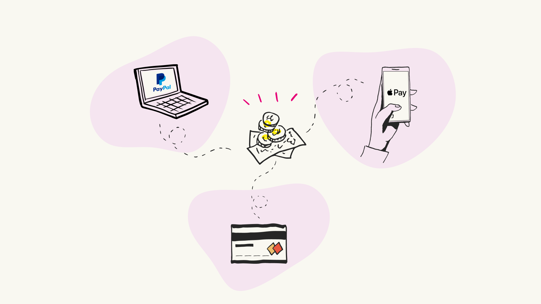
8. Provide Multiple Payment Options
Not all customers prefer to pay with a credit card. By offering multiple payment options, such as PayPal, Apple Pay, or Google Pay, you can cater to a wider audience and make the checkout process more convenient for your customers.
Additionally, make sure to clearly display the accepted payment methods on your checkout page to avoid any confusion or frustration for customers.
9. Include Order Confirmation
After a customer completes their purchase, it is essential to provide them with an order confirmation page. This page should include details of their purchase, such as the items ordered, total cost, and estimated delivery date.
Order confirmation not only reassures customers that their purchase was successful but also provides them with important information for future reference. It also helps reduce customer inquiries and support tickets related to order status.
10. Optimise for Mobile
With the rise of mobile shopping, it is crucial to ensure that your checkout process is optimised for mobile devices. This includes having a responsive design, easy-to-click buttons, and a simplified layout.
Additionally, consider implementing mobile-specific features such as autofill options and mobile payment methods to make the process even more convenient for mobile users.
How can we help you?
A well-designed checkout process is crucial for the success of your ecommerce business. By following our checkout best practices for UX, you can simplify the process, increase conversion rates, and improve customer satisfaction.
Ready to enhance your checkout UX and boost your conversion rates? Our team of experts is here to help. Contact us today to discuss how we can optimise your checkout process for maximum sales and customer satisfaction.
Related posts
-

Blog
What are deceptive patterns?
Another quiet night in, another night binging my favourite series on Netflix. My phone pings, it's from Amazon. It says my Amazon subscription is renewing…
-

Blog
Q&A series: a day in the life of a Principal UX Consultant
It’s no secret that a lot of interesting, inspiring work takes place here at Nomensa, and we love looping you in on our projects via…
-

Blog
Q&A series: a day in the life of a Talent Acquisition Specialist
Nomensa’s Talent Acquisition Specialist Corrie Lloyd talks us through her career journey, a typical working day and the importance of collaboration in her team.
-

Blog
How to be T-shaped
Senior UX Consultant Darren Horne discusses what it means to be ‘T-shaped’, and why it’s so beneficial.
We drive commercial value for our clients by creating experiences that engage and delight the people they touch.
Email us:
hello@nomensa.com
Call us:
+44 (0) 117 929 7333