Scouring through UX blogs on the topic of menus, IA, or navigation you will find the theme of buckets. The golden rule seems to be “never use them”. A ‘bucket’ is defined as a menu item into which almost anything could fit – they are typically labelled with vague words like ‘Miscellaneous’, ‘Information’, ‘Other’ or ‘Stuff’. These have effectively been crucified as “the ONE thing you must never do”. So at the risk of being virtually crucified, I am here to defend them.
This article is not concerned with exactly what we mean by ‘IA’ or ‘Navigation design’ or ‘Interaction design’ – it is concerned with the choices you present to your users when they arrive at your website or app.
It is fairly easy to criticise a set of choices which include an ‘Other’ or any bucket type group. But I argue that many menu systems out there do a lot worse. They are committing other ‘crimes’ against UX; and one reason for this is that designers are making their task much more difficult by avoiding resorting to the use of a bucket. These other crimes include:
- Including choices which seem to overlap heavily in meaning;
- Including too many choices at one level;
- Using many categorisation schemes per level;
- Using unwieldy labels, or labels which only make sense to a few people.

Figure 1: There is a lot of overlap in meanings on the RYA site, and far too many choices
Users and choice
Let’s forget about menus and navigation for one second and rewind right back to thinking about the human mind and the nature of choice. We have a vast array of strategies to help us reduce the amount of effort needed for mental tasks. And we are incredibly skilled with them.
When confronted with an initial set of choices, we understand there are choices within choices, and at the end there is some sort of content. We will immediately start to organise them in our minds, and begin to silo whole chunks of data into groups. For example in animal classification or the periodic table; we only have to remember a small number of groups and a few simple rules for each group, rather than applying rote learning to all the animals or all the elements. This is what we do with IA too – we try to group everything up into a small number of groups to aid memory and identifying.
Designing choices
Now let’s take the designers point of view. You’ve got a mass of content – its complex and it’s too large to just stick all of it in front of users and expect them to find what they want. So you sort through it, you find ways to assign items into groups, then come up with meaningful names for them.
Your aim is to create groups which are distinct, clear, and small in number. But in practice this is very difficult – it is the sort of problem that will almost never yield a perfect solution, where compromises must be made somewhere.
Assuming a decent business model and content strategy, most of your products or services or bundles of information should group together in some sort of logical way. However there are many reasons why people will come to your company – and there are many niche user needs that just don’t quite fit in.
So what are your options?
1. Attempt to find clear groups for everything and present all of them up front;
Effects:
- Some items will look out of place;
- Users have to choose between a larger number of options;
- The overall understanding of the range of options available is heavily convoluted.

Figure 2: An example of too many options, including many which overlap and some which are meaningless to most users
2. Use a bucket item
Effects:
- The rest of your groups will be easier for users to scan and cognitively easier to process;
- Users have to choose between a smaller number of options;
- Navigation becomes easier to scale to smaller screen sizes.
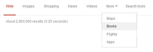
Figure 3: Google search choices
Many sites are utilising the ‘More’ option in navigation menus. We can see above an example from Google search results, and below the BBC header and BBC Sport navigation. This allows the rest of the choices to stand out, look more important, and be more easily understood. As users, our understanding of Google and the BBC as businesses are not compromised at all.

Figure 4: BBC Sport choices
I argue that ‘A, B, C, D, Other’ is preferable to ‘A, B, C, D, E, F, G’ where E, F and G are more niche, less understood – and inevitably complicate users’ perceptions and understanding. I argue that it is also preferable to ‘A, B, C, D, E’ where three of these are buckets in disguise (see later).
Every extra choice has an effect on the perception and understanding of the rest of the choices
This is crucially important. To state the obvious, fewer options are easier to choose between. One option would be ideal. If you haven’t seen or read about it, please see the paradox of choice for background. For every item you add, it means added effort required from the user both in terms of visual scanning and in the process of understanding the business as a whole, the scope of the site, and their options from that point.
Buckets-in-disguise
With a more complex array of features available, it becomes a little more difficult. I present examples from both Microsoft and Apple below. I propose that in deciding upon these menu items, the designers tried very hard to fit everything in – and in the process ended up agreeing upon labels which became catch-all categories without ever intending to. I call these ‘buckets-in-disguise’.

Figure 5: An old version of Word
Let’s take the old Microsoft Word menu – and scrutinise:
Buckets-in-disguise: ‘File’ ‘Window’ & ‘Tools’ (Options)
Furthermore, ‘Edit’ and ‘Format’ surely overlap a huge amount in meaning.
How many times have you been looking for something in a menu and ended up in ‘Options’? (I’m thinking mostly about various dialog boxes and printing menus and applications in Windows). ‘Options’ becomes a sort of safety net that users fall back on. What is really annoying however is that you have to remember where ‘Options’ is. Is it under File? Edit? View? Wouldn’t it be better to have the back-up last resort catch-all category on the top level, rather than challenging people to find it every time?
Let’s try the mac desktop menu.

Figure 6: A more current Mac menu
Buckets-in-disguise: ‘Finder’, ‘File’, ‘Go’ & ‘Window’
Really? ‘Finder’? Let’s just think for a minute. What is the point of a navigation menu? To help people find things. So what are we to make of a category called ‘Finder’? Would that not contain everything under the sun? Sure it’s a good name to attract attention, but as an item alongside several others – surely it creates overlap with everything else. Furthermore, it’s not even honest about overlapping with everything; it pretends to have single identity – confusing the user further.
So what have we ended up with? A hazy mess of tenuous words and you are still relying on users getting used to where things are.
How buckets can help with choice
What you want users to be able to do is see an item and think ‘Aha, that’s easy – that’s where all of the [content] will be’ – they can then siphon off all of those items in their mind and therefore make the rest of the siphoning task much easier. The Windows and Mac menus presented here just do not provide enough clarity for that.
The often quoted reason for avoiding buckets is that users won’t know what it contains, and that any item could theoretically go in there. Ok, the second one is true.
However, considering all the choices together – users have already siphoned off many other chunks of information by interpreting the more distinct choices. And therefore they only have one logical conclusion to make – yes you guessed it – everything else is in the bucket!
When not to use buckets
At this point I must make it clear that there are also many situations where they don’t work. Hopefully I have persuaded you not to recoil in horror upon encountering one, but to consider them on a case-by-case basis. However there is a reason why they became known as mistakes in the first place; and as such there are clear cut situations where they will be troublesome:
- Using two buckets in one set of choices will not work;
- When the rest of the set of choices are not distinct or clear, the bucket hasn’t worked either. Remember, the point of introducing one is to give you more freedom for the rest of the choices – and to have less of them;
- When the contents of the bucket will be so far-reaching that the organisation of the next level down will still pose exactly the same problems as you faced in the first place;
- If you can produce a truly easy and usable set of choices for all core user journeys without using a bucket, then don’t!
Take home messages
This article is more of a thought piece rather than a concise set of tips. However I will attempt to summarise the messages:
- Think about golden rules before you abide by them. In this case, think about why it is such a bad idea to use ‘bucket’ items – and then see if those reasons really do apply to your situation.
- Be honest with yourself and your organisation about what labels are buckets. There are many buckets-in-disguise out there, so watch out!
- You should view a bucket as a weapon in your IA arsenal, rather than something to avoid.
- If you decide to use a bucket, be loud and clear about it! Your users will get it. Put it up front and label it clearly as a bucket. Don’t hide it away. Be proud of it (just don’t use two!)
- Match user expectations as far as possible. If something addresses a niche user need, users will expect it to be less prominent than core needs.
- Stop worrying so much about finding places for content to live – and start worrying about designing for easy choices.
Related posts
-

Blog
The importance of microcopy
Lauren Ellis, copywriter at Nomensa, outlines microcopy and explains why your business needs to start sweating the small stuff.
-

Blog
What is faceted navigation?
If your website contains a large amount of content that can be grouped in a variety of ways, Information Architecture (IA) design can be challenging.
-

Blog
The content-first approach: How to get a competitive edge through great UX
In ‘The content-first approach: How to get a competitive edge through great UX’, Principal Content Designer Steven Shukor explored the value of good content in building trust and loyalty and driving engagement.
-

Blog
How content design makes for happy customers and search engines
Standing out from the crowd can be a struggle. Content Designer Mark Foley explains how good content design can help you do just that, while making content that is gentle on your users’ brains.
We drive commercial value for our clients by creating experiences that engage and delight the people they touch.
Email us:
hello@nomensa.com
Call us:
+44 (0) 117 929 7333