*Many of the reasons people don’t like forms – image by Daniela Meleo*
It seems the only people who enjoy forms in any way are those who get to criticise them for a living. You may also think there to be masochistic form creators out there who enjoy deliberately creating frustrating experiences; but I believe they are simply failing to grasp how many problems a set of question and answer fields can run into. Currently, as Luke Wroblewski puts it: “Forms suck”. People hate forms. They are a necessary evil in the world, representing a barrier between a person and something they want to do.
The way forward
In this and subsequent articles, I will be focussing on improving long, multistep forms. I do not wish to suggest ‘micro-improvements’; not because they aren’t important, but because they have been looked at and tested before and many solutions are out there. Instead, I wish to suggest ways in which all these elements can be brought together and enhance the overall user experience. Here is our vision:
- Forms will cease to be a separate section of a customer experience;
- There will be no definitive beginning to a form; interaction will begin before the users know it;
- Forms will become real conversations with users, tapping into their emotions, toggling between paratelic (journey-driven) and telic (destination-driven) states;
- In the future, as much time, money and effort will be put into perfecting form algorithms as is put into search algorithms now, to make forms as intelligent as possible;
- Users will no longer have an intense hatred of forms.
Is this unrealistic? I suppose that is for you to decide.
Four Articles
This article will cover an important principle: the reservoir of goodwill. This needs to be understood and accepted as a concept before progress can be made. Part two is all about visualising the form as a real conversation between the user and the organisation; and looking at the pace and balance of that conversation. Part three will focus on strategies for dynamic web forms and when to use each one. Part four will be about data quality and its understated importance in modern times. The following links are also highly recommended for an overall education on web forms:
- Forms that work (Caroline Jarrett)
- Sign up forms must die! (Luke W)
- Web Form Usability (Smashing magazine)
The Reservoir of Goodwill
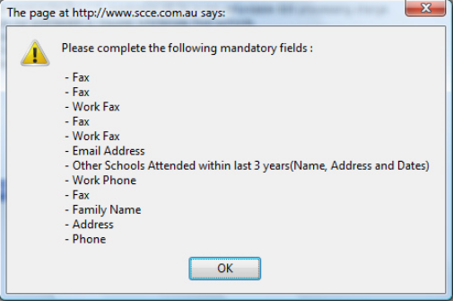
This is Steve Krug’s idea of a fluctuating amount of ‘goodwill’ which we can influence through design. Forms are the perfect challenge for us to apply this idea to. Occasionally, maybe even often, we are all forced to fill in a long, boring, multi-step form. Unfortunately, the longer forms out there also tend to contain the harder questions, provide the least amount of in-line help and are associated with much more risk if they are not completed correctly. Insurance claims, Loan Applications, you know the type.
Bigger forms equal exponentially bigger challenges for designers
Furthermore, we don’t even start forms until the last minute. This is not our fault; this is a natural and sensible human behaviour and it will never change. Usually, the sheer necessity of completion and the added time pressure becomes the main motivation for users. Needless to say this heightens emotional responses to usability issues no end.

*Forced abandonment (cartoon by Axbom)*
Steve Krug coined the brilliant phrase . The reservoir represents the amount of effort that a user is prepared to put into doing something. While the reservoir may begin at a fixed size, it can fluctuate depending on many things such as the perceived reward of continuing. However, good design and usability also increase the reservoir. If a user expects to have to type in their address, and instead only types their postcode and presses ‘Look up address’ (and it works), this exceeds their expectations and increases the reservoir, therefore motivating them to continue. In contrast, bad design or usability issues which slow down or frustrate users will decrease the reservoir, resulting in a higher desertion rate. I view this as a very human reciprocity; “If you put effort into designing this form to help make it easier to use, I will put more effort into filling it out”. This is not trivial either, this is a very real phenomenon; emptying the reservoir forces users to leave. This is forced abandonment, and it’s in our genes. Every single usability issue on a form is a reservoir-decreasing stumbling block and we are further towards forcing abandonment; but it is also an opportunity to put it right, reversing the effect and exceeding expectations. Testing your form is incredibly important to find these issues! There is a greater problem here about expectation. On a long form, the finish line is not in sight. Sports psychologists talk about the importance of ‘visualising the finish line’ in order to make the entire task seem achievable. Why not apply this to forms? We need to persuade users that completion is possible. If they are not reassured of this, the reservoir may empty straight away. I don’t think anyone can argue that people generally prefer to have an estimate of how long something will take, rather than be left in the dark.

Visualising the finish line of a form
Users need this information so they can input it into the ‘cost vs. reward’ equation that goes on in their heads. To help them solve this equation in your favour, make sure that users know:
- What is the reward for completing the form?;
- The finish line is achievable;
- Roughly how long the form will take;
- Their answers are auto-saved and they will not lose any data;
- They can just as easily complete the form in multiple sessions;
- The form contains some helpful features and has been designed for ease of use;
- There is at least a basic form of customer service in case they do get stuck.
Service Design
This is where the process comes together. As part of our vision, we do not believe forms should be separated from the rest of the customer experience, or the rest of the service. The shorter forms out there, for example sign-ups, are already becoming more and more integrated with the rest of the user journey. We should design for this integration, as well as multiple sessions, multiple technologies and multiple devices. This will promote a continued engagement in a service, of which a web form plays a part. This is one way to reduce the intense hatred mentioned earlier and turn the process into a positive interaction.

Many other interactions happen when interacting with a form
Consider this. When someone fills out a form, how many other interactions are happening? They may come back to questions they may phone up a help line, they may receive an email with their log in details, they may ask someone else for a document or visit another web service to find out an answer. They may want to carry on filling in the form on their iPhone. They may want to complete the easier questions in a fatigued state, and tackle the harder questions when they are feeling up to it. It may be several months between visits to the same form. We must design with all these things in mind and consider proper service design. Despite any holistic improvements made to the experience, we must accept that at some point users will have to input data, and input it correctly. Some of it is simple, some is complex; some known, some unknown. This is our challenge; and the solutions will be sourced from a combination of interaction patterns old and new; micro-improvements to how forms work; creating short-cuts through dynamic and intelligent forms and data quality. One other understated theme of form design is the pace and balance of them. Simply, what are we asking users to do, and in what order? Part two will therefore look at the optimal way to present long forms to users, so that when they do have to get down to it and input their data; their experience is optimised, and above all, humanised.
Related posts
-
 is Essential for eCommerce ROI")
Blog
Why User-Centred Design (UCD) is Essential for eCommerce ROI
In the fast-paced world of eCommerce, simply having a functional website is no longer enough. To truly thrive, businesses need to offer an experience that…
-

Blog
10 Essential Checkout UX Best Practices
Paying for a purchase is the most crucial part of the online shopping process, but recent research by the Baymard Institute has placed the customer…
-

Blog
What are deceptive patterns?
Another quiet night in, another night binging my favourite series on Netflix. My phone pings, it's from Amazon. It says my Amazon subscription is renewing…
-

Blog
Q&A series: a day in the life of a Principal UX Consultant
It’s no secret that a lot of interesting, inspiring work takes place here at Nomensa, and we love looping you in on our projects via…
We drive commercial value for our clients by creating experiences that engage and delight the people they touch.
Email us:
hello@nomensa.com
Call us:
+44 (0) 117 929 7333